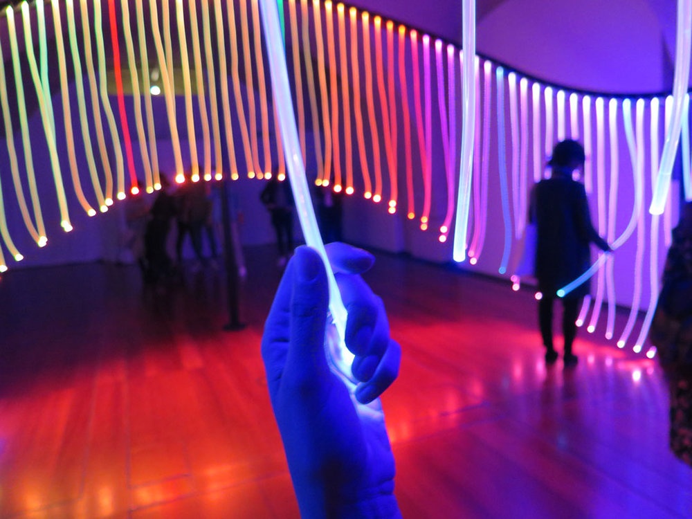
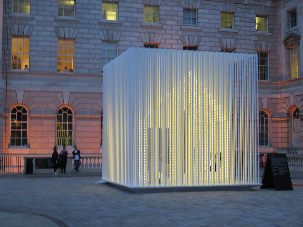
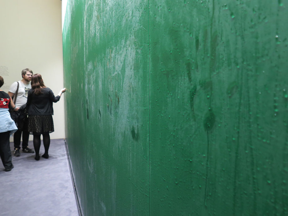
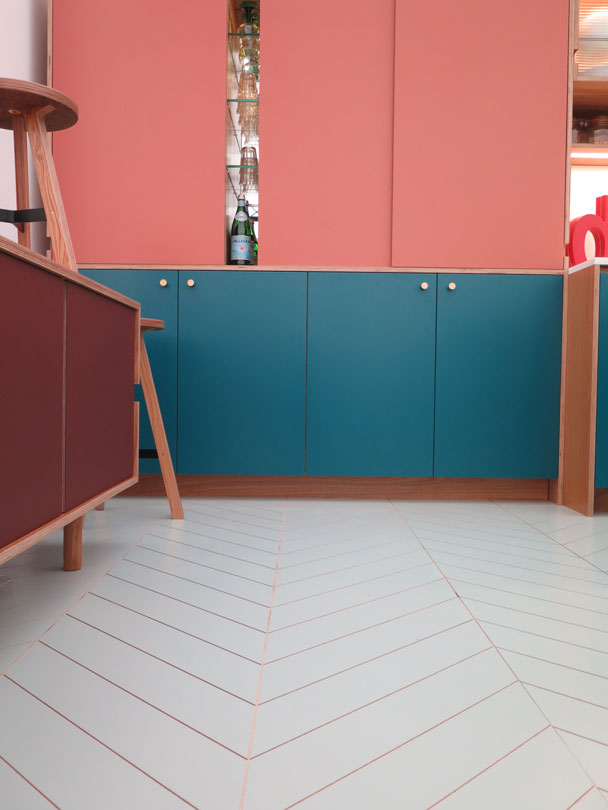
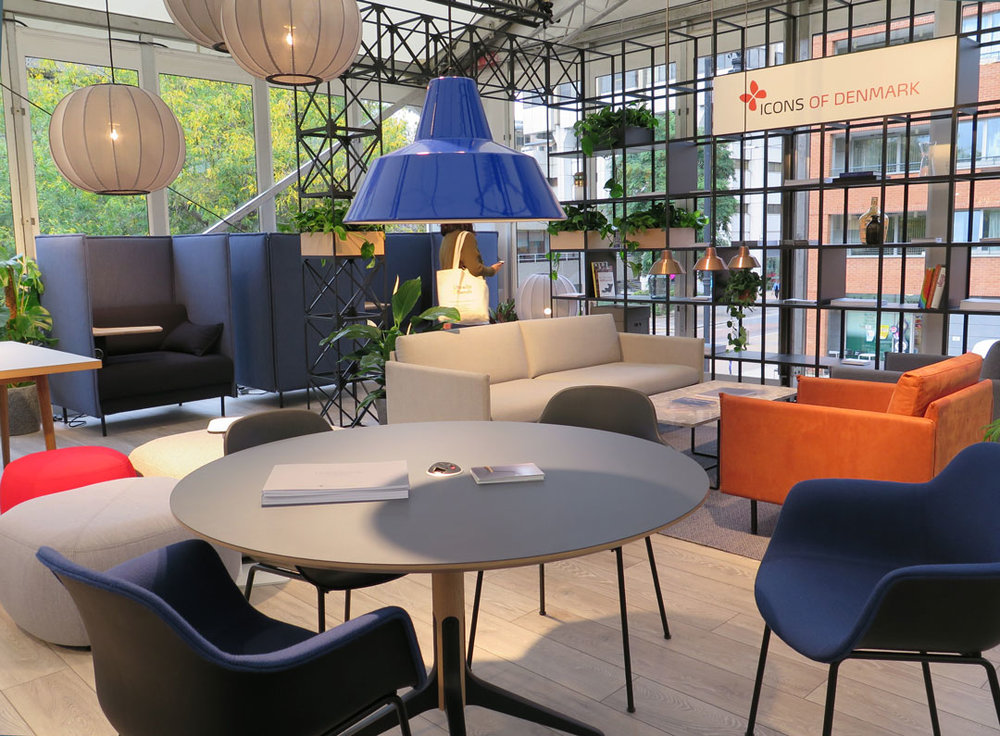
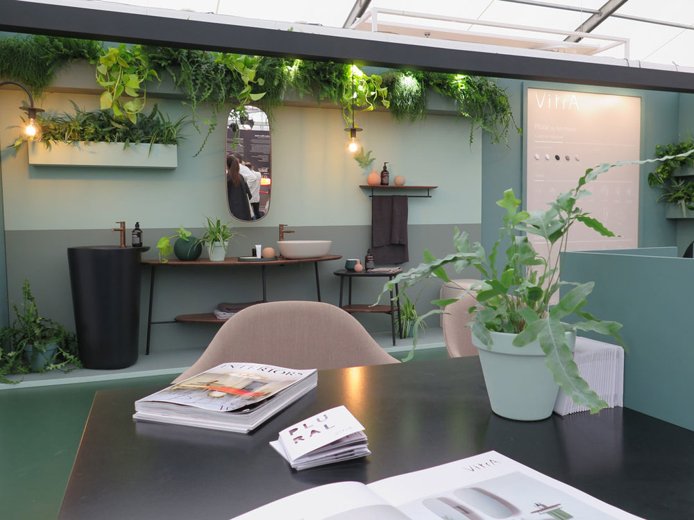
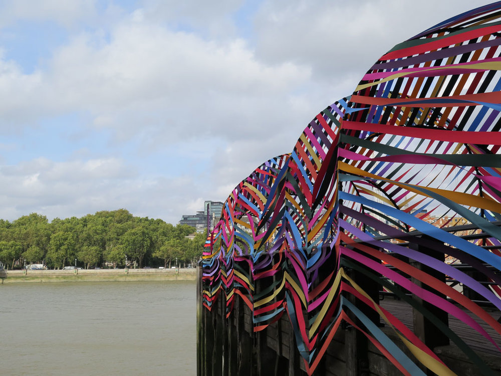
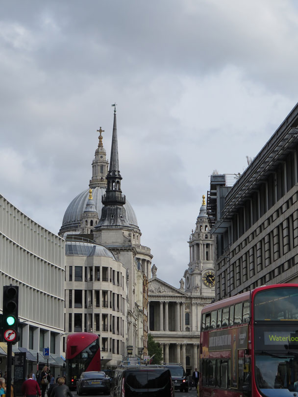
It’s that time of year again and the annual hike through London streets to see the latest, most beautiful design wares on offer across the city.
During my trip this time, it got me thinking about this fascinating place; the people, the infrastructure, the buildings and the culture.
Having lived and worked here for many years, I can see its appeal, feel its rhythm, as much as I can see how relentless and exhausting it is. I ventured for a day trip with my design head and this time I had a different lens on what I was seeing and how I was seeing it.
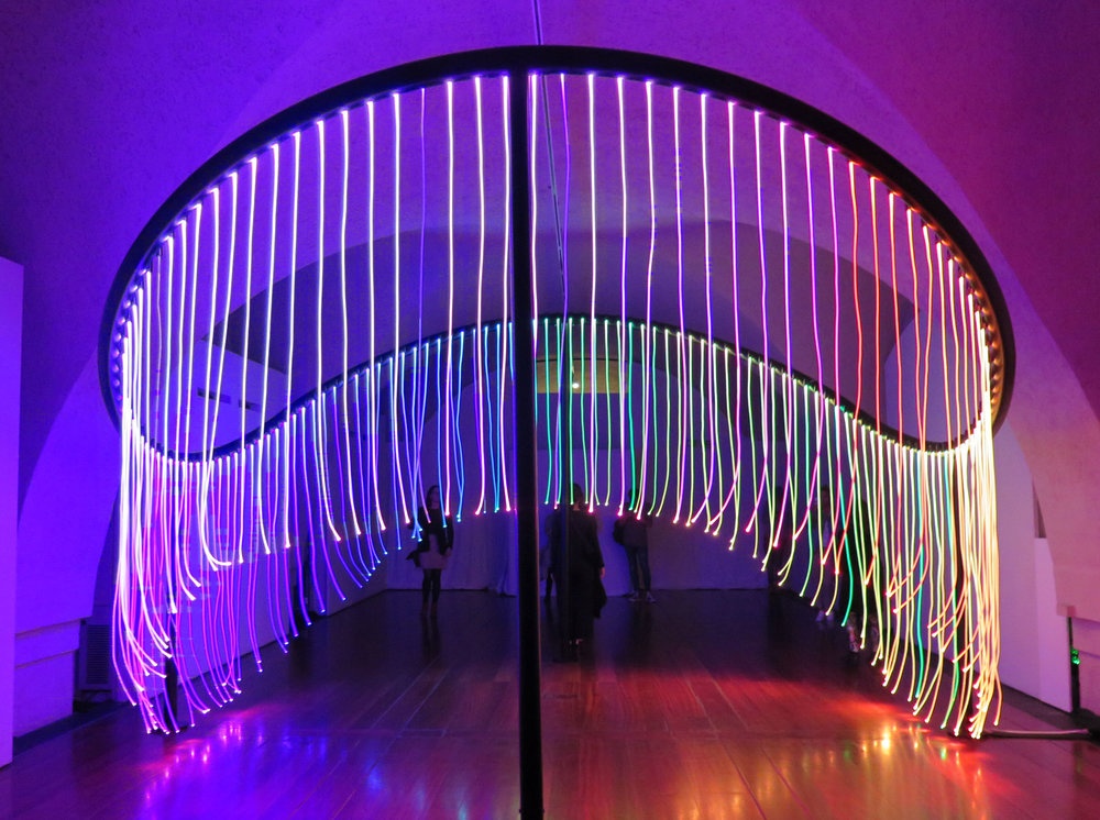
Here are some things I thought we can learn, in our design and creative process, from this magnificently crazy city:
1. Diversity rules supreme
Embrace the delights of the new, and nurture the old, mix polished and tarnished, modernity with tradition, grey skies and pillar box red… The subtle balance of these adds character and richness.
2. Simplicity is key
Got lots of ideas or information to communicate? Keep it simple, strip it back to the bare essentials: the underground map is a triumph of simplicity and accessible design. Genius.
3. Surprise and delight.
There are so many hidden gems, nooks and secrets in London’s streets. The unexpected can delight and bring joy.
4. Be bold.
Pushing the envelope has what’s made London world class, not just a good city. The eccentricity and boldness of people, buildings, music, retailers cease to amaze…
5. Be true to yourself.
Don’t shy from reinvention, to rebuild following times of adversity, or to forge a new way ahead, but never forget your roots and what’s authentic to you. London will never be anything but quintessentially British.
6. Be open.
As the major Sadiq Khan says #londonisopen. This campaign sends a strong message of the importance of being welcoming, collaborative, accepting and breaking down barriers.
I think we can learn a lot from this place and bring some of its principles into our own design processes.
Mind the gap!
Some highlights:
