Handmade in Love, Hope and Power.
BEELOVE
WHAT WE DID TOGETHER
Brand strategy
Brand voice
Messaging and copywriting
Brand identity and design guidelines
Brand guidelines
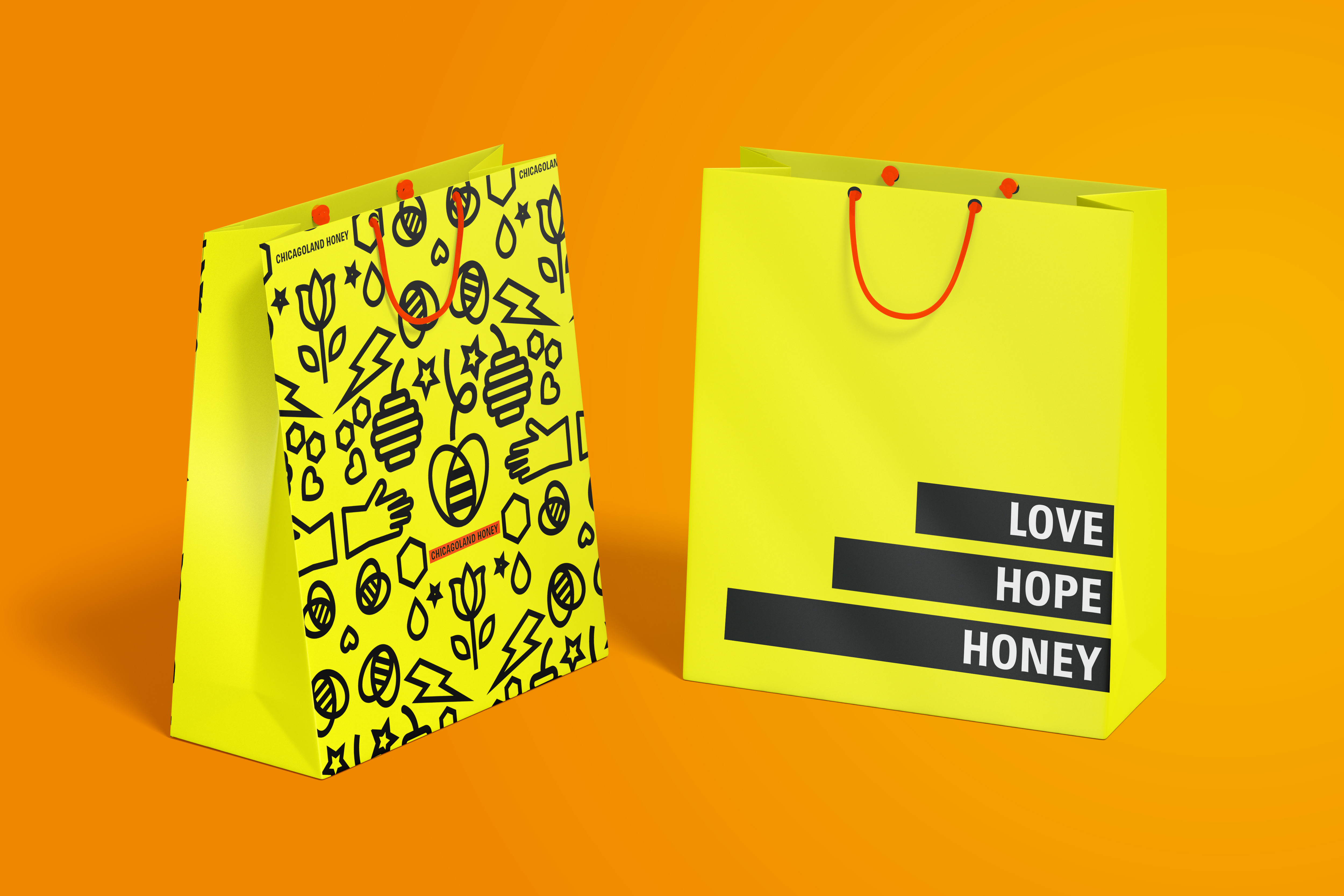
Brand application and materials
Social media assets and campaigns
Website
Packaging
Beelove’s hive-to-jar products are high-quality, raw honey products handmade by justice-impacted individuals who are in their journey of rediscovering their purpose and redefining their future.
Together with founder Brenda Palms and her team, we transformed beelove’s brand to represent their vision to empower people through honey and hope.
THE CHALLENGE:
Establishing beelove’s Own Brand
beelove’s work sits at the heart of the Sweet Beginnings programme, run by NLEN in Chicago. It supports justice-impacted individuals through employment opportunities, training and access to work. The results are amazing, with a recidivism rate of only 7%, compared to the national average of 44%, beelove powerfully changes people’s lives.
But beelove’s brand wasn’t telling the bigger story and impact: it was only seen as good quality honey products produced under Sweet Beginnings programme. We wanted beelove to stand out on its own in the market and compete with premium beauty brands. It was time to build a brand that actually reflected the passion of the organisation and the difference it makes on people’s lives.

The Research:
Real Stories of Hope
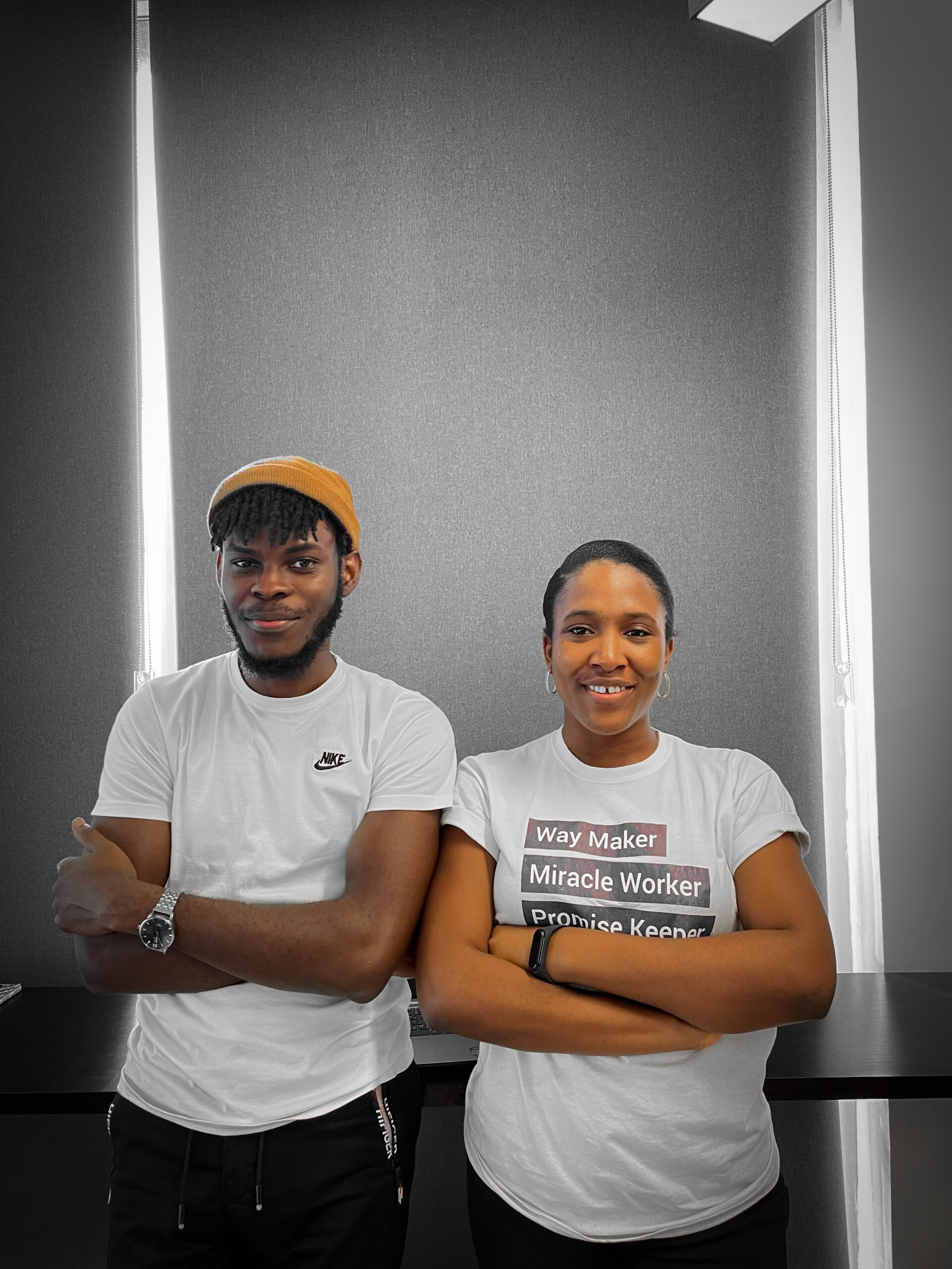
The research process was unique – not only did we get to talk to board members, team leaders, and staff, but we were able to interview people who have been through the programme. Individuals who are committed more than ever to help other justice-impacted individuals in their journey because they were first transformed by the work.
Brenda Palms, the Founder, herself is the embodiment of love and care for people and her community. Indeed everyone behind beelove was passionate about giving hope to those in the justice-impacted community, as well as protecting and cultivating bees. We knew that this passion is what made the brand unique.
“If there was ever a dream client, beelove was it! What an incredible team and impact – a double-whammy of social good for the community AND environment. We wanted to capture the vibrancy, passion and vision of this brand – transforming it into a competitive, b2c brand with real personality. This brand had it all- we just held a mirror up and magnified what was there all along: a powerhouse of a brand in the making.”
Lauren Jones, Brand by Boudica
THE STRATEGY:
A Powerhouse of Impact
When we matched Brenda’s heart and the team’s passion with the drive and power to make a change, it was a beautiful combination. We realised beelove is a powerhouse—of quality, hope, beauty, and impact. And that this reached far beyond the product, into the community.
From the stories of individuals that produce the honey products, the love of the bees, and the transformation the organisation brings to the community, our goal was to tell the power of this narrative and impact. In doing so, transform beelove into its own retail and consumer-facing brand.
“The joy of this brand was bringing the grit, passion and impact of the work to the identity – there was a huge opportunity to align the branding to the cause, connecting with the story and its people more strongly. In doing so, we created a competitive consumer brand that has already opened up opportunities for brand distribution and growth.”
Lauren Jones, Brand by Boudica
The STORY:
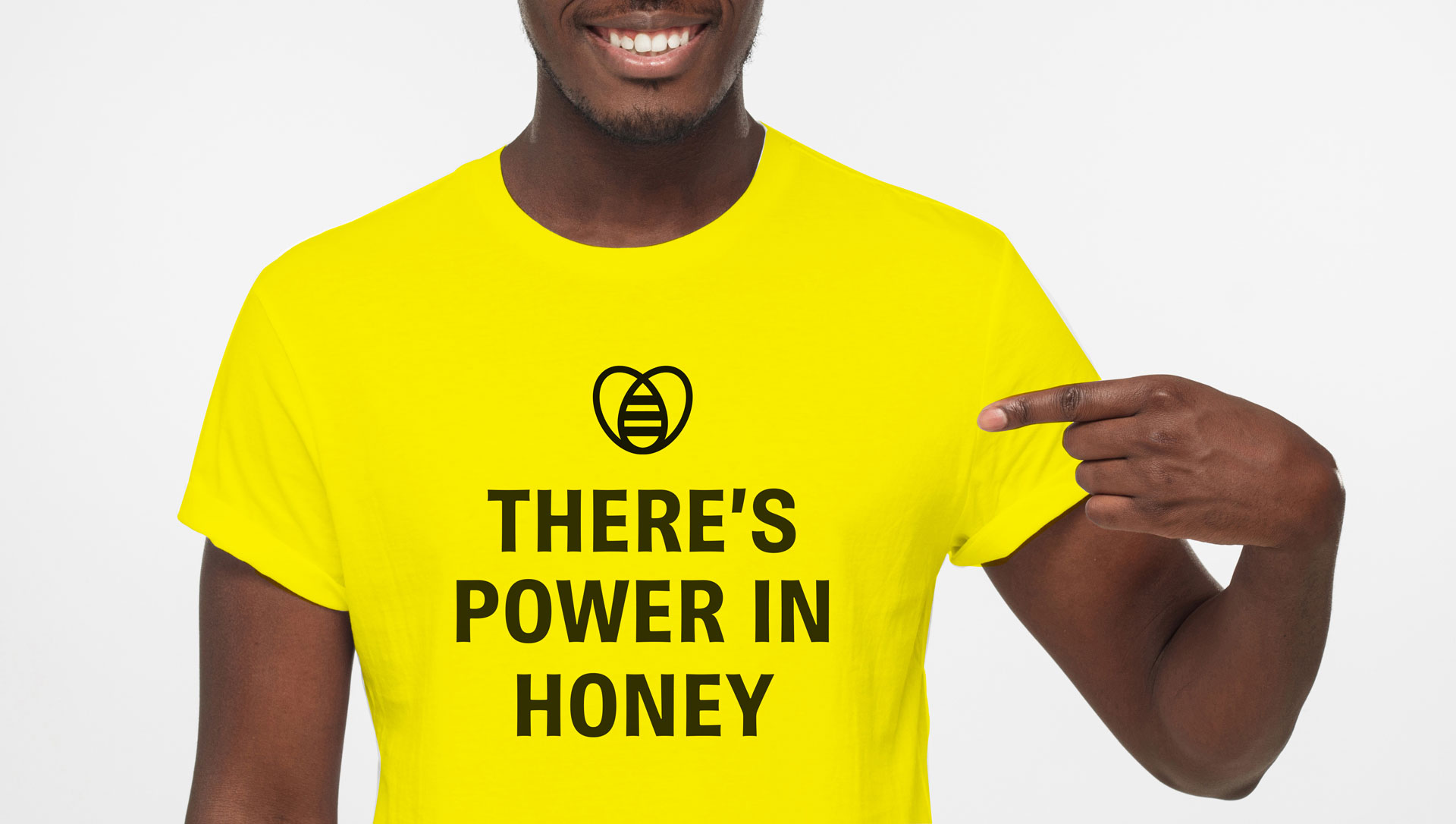
There’s Power in Honey
To capture the whole story of beelove, we honed into the word ‘power’. ‘There’s Power in Honey’ has two-fold meaning:
1. In helping justice-impacted individuals to step towards a brighter future,
2. Honey is an effective, natural resource.
As beelove grows, it will reach more people and bring more change to the community, support more bee populations, producing more product – creating a ripple effect of impact.
THE IDENTITY:
Optimistic, Human, Passionate
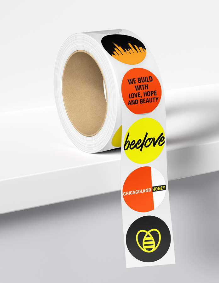
From the beginning, we wanted beelove’s brand to be vibrant, energetic and gritty. A visual identity that could represent the beauty and heritage of honey products, but still bold and striking—embodying how socially impactful the organisation truly is.
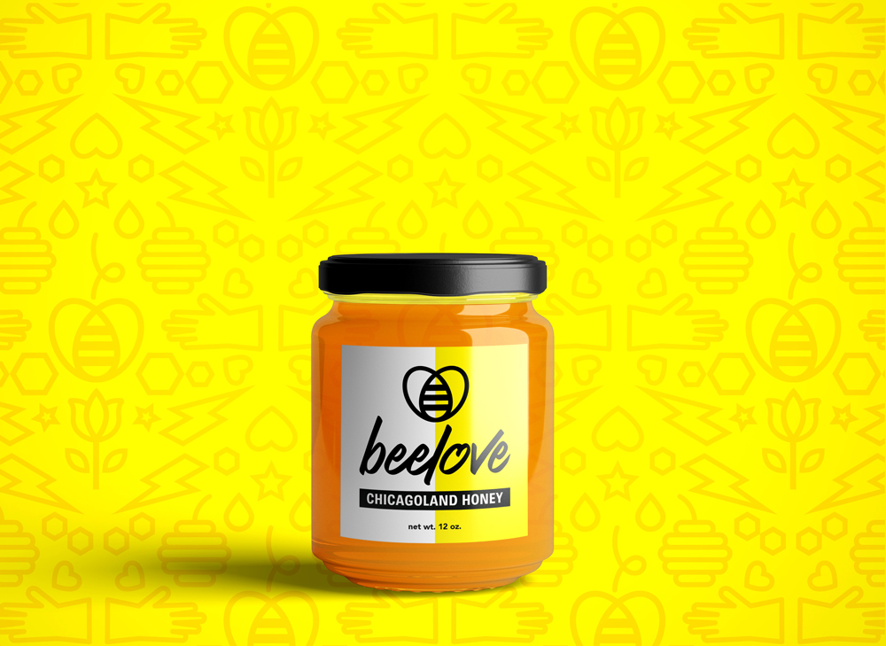
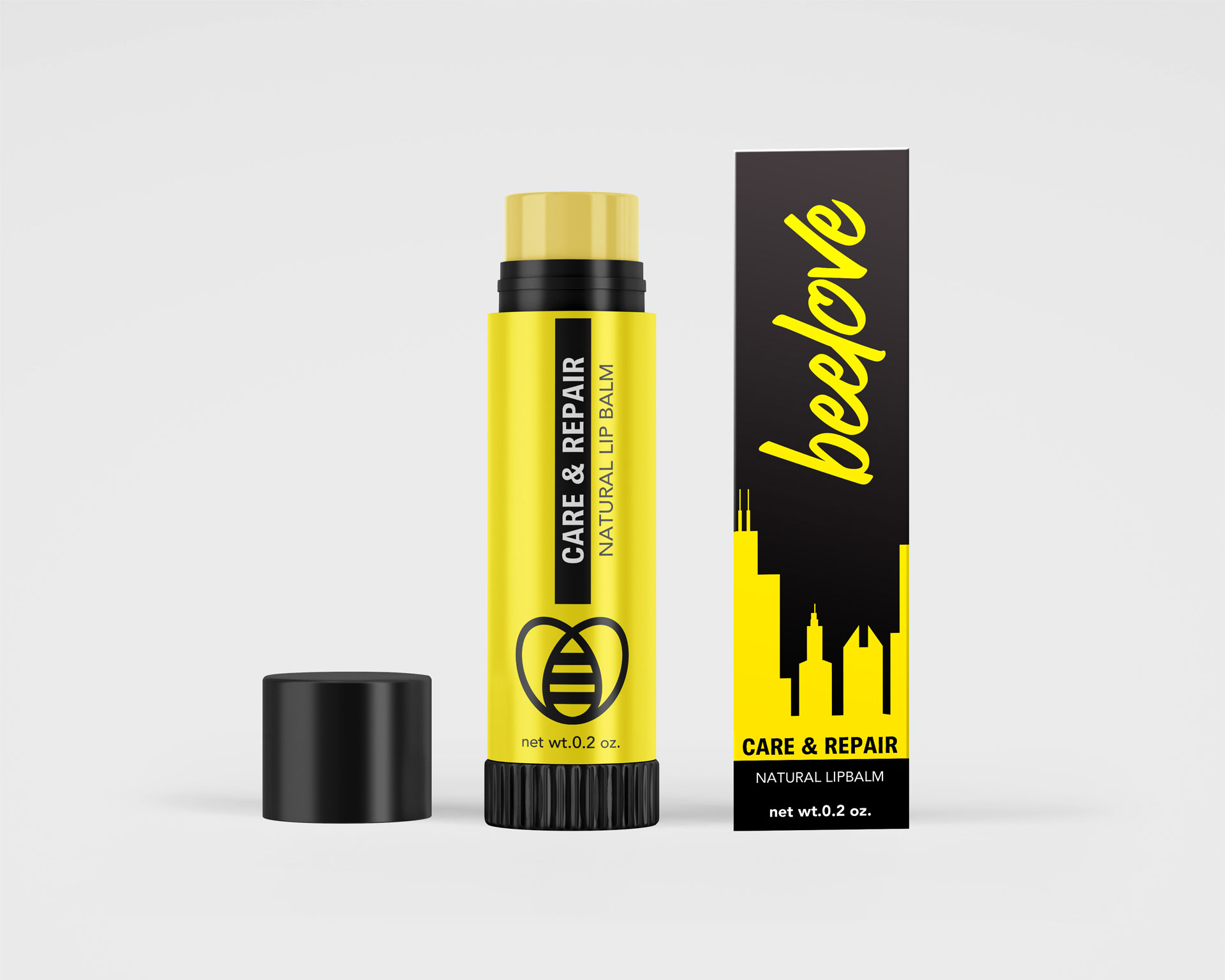
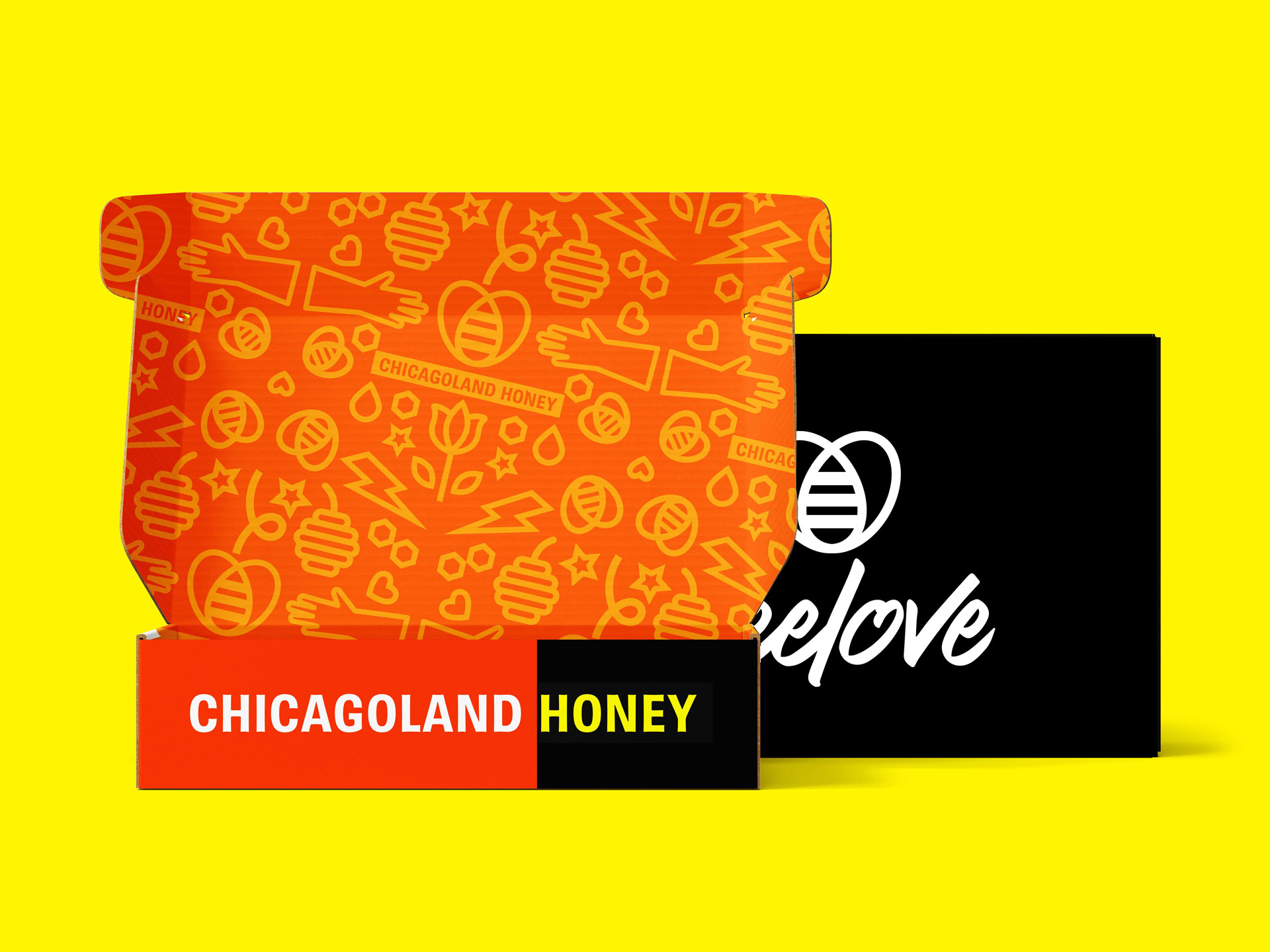
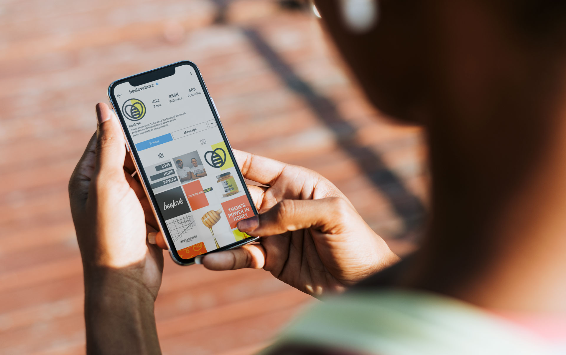
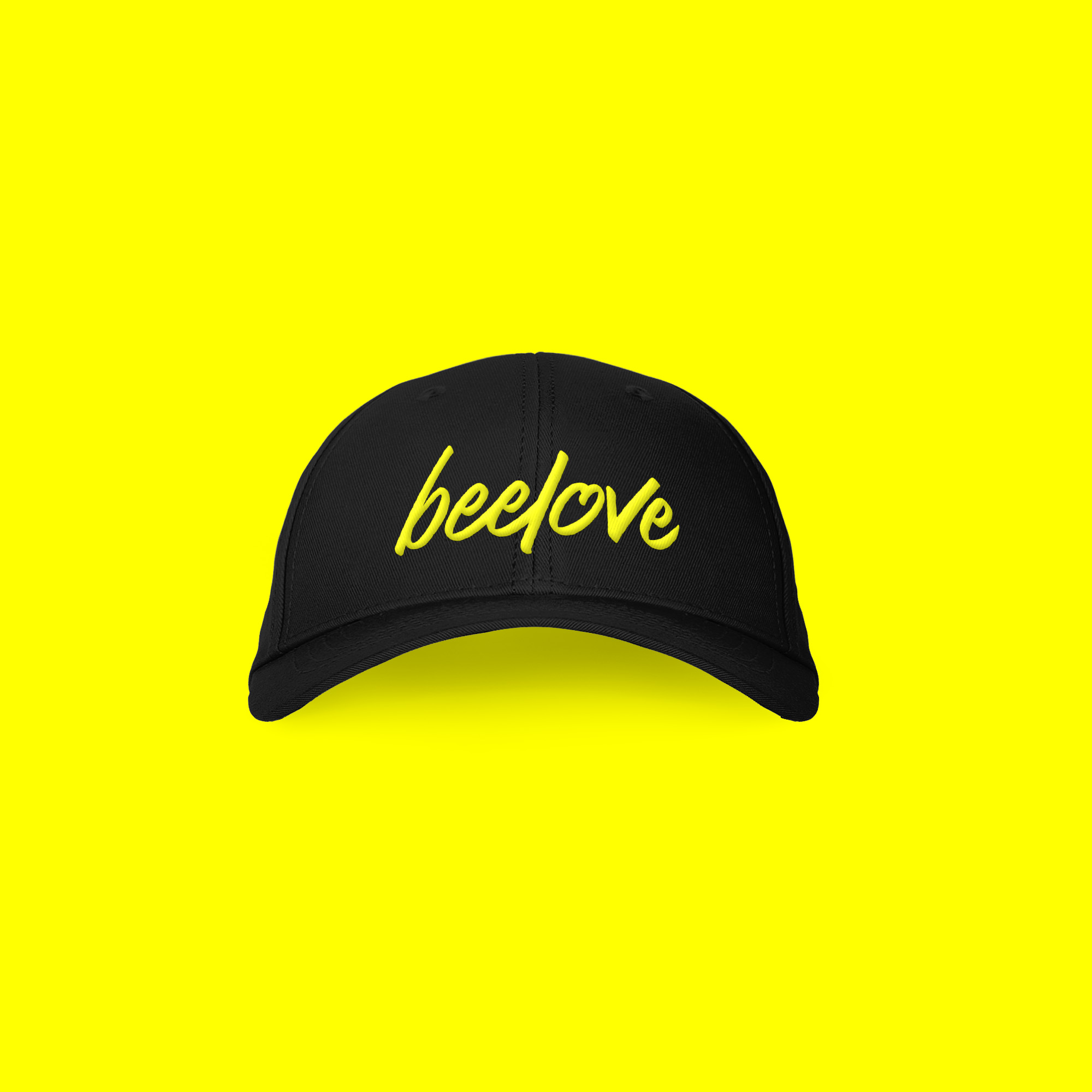
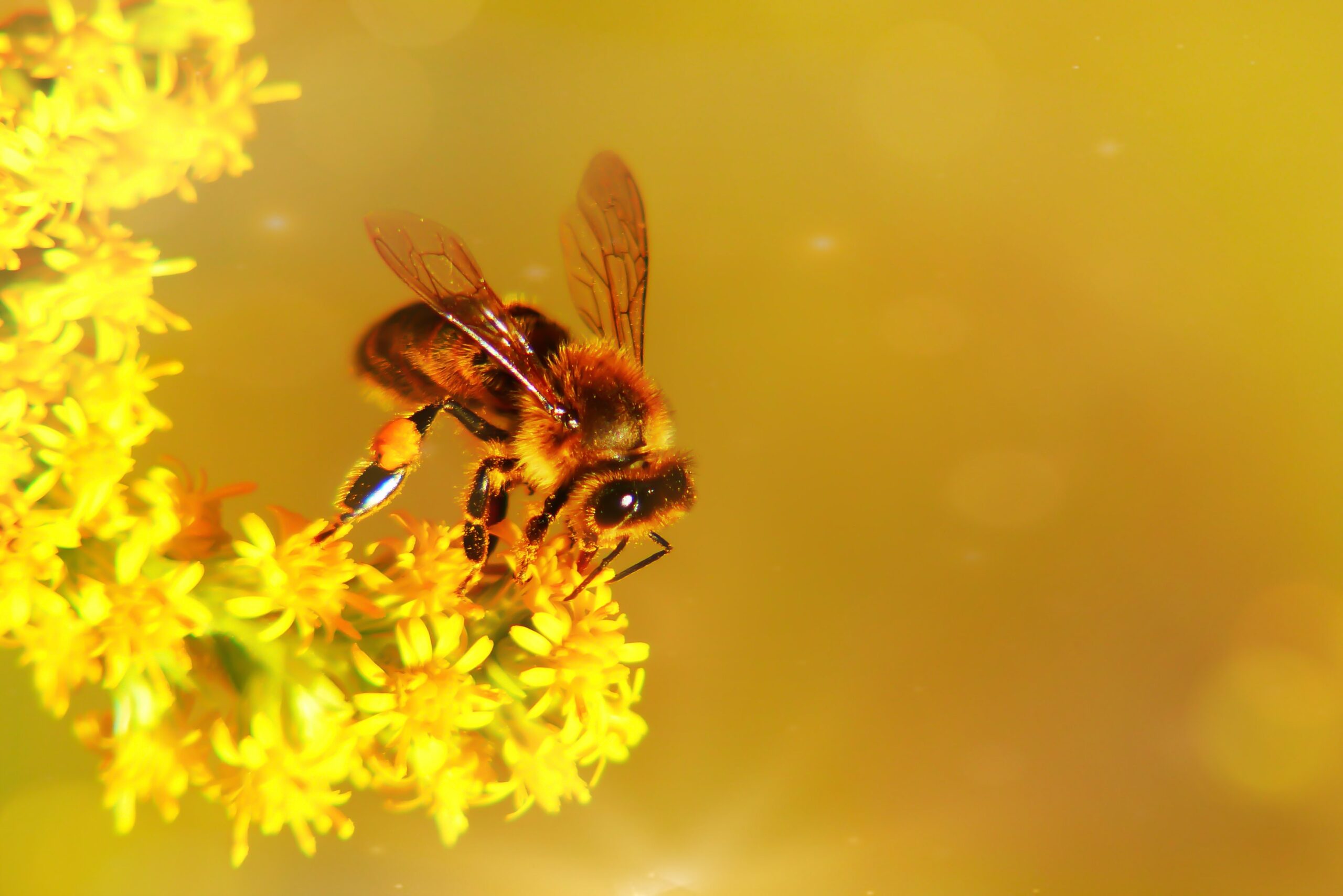
With a combination of black and yellow as the starting point, we added orange to add more depth to the palette and represent honey. The bee icon represents both love (heart) and the honey bee. We designed a word mark with curves and handwritten qualities to it, a nod to the handmade process and the individuals behind beelove.
The impact:
The Trajectory to Growth
Knowing that their products are backed with impact and vision, the new brand gave the team confidence to show up and tell their story to the world. In the first open day to launch the brand, beelove quadrupled their sales and got a new contract. And this is just the beginning!
They’re not just scaling opportunities—they’re scaling their impact. We repositioned beelove with prominence and purpose, paving the path to grow bigger and continue to empower people through honey and hope.
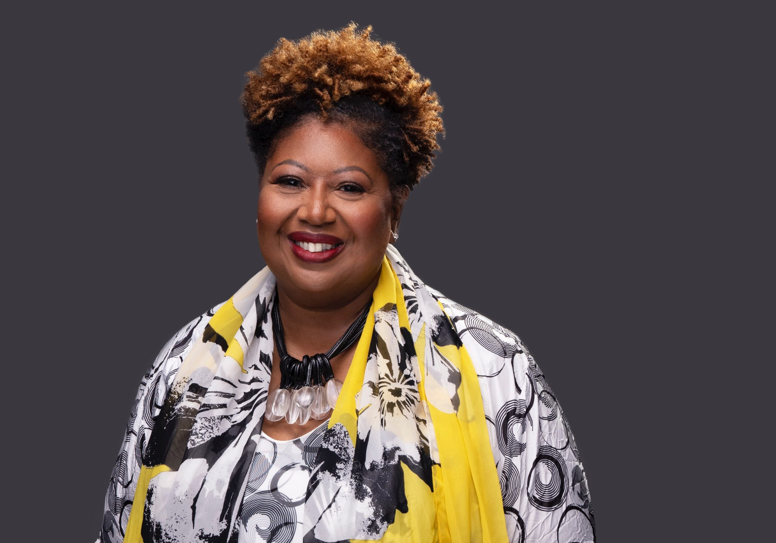
“This is exactly what we needed – you’ve put everything into this. I can’t tell you what it means for us.”
Brenda Palms, Founder.