
A logo.
Seen to be the shining beacon in branding, and first thing we think of when we think of it.
But what is the role of a logo? What makes a great logo? How should you approach your logo design project?
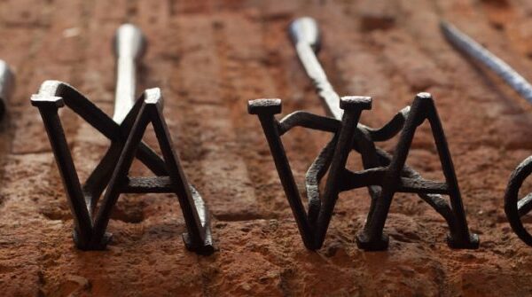
WHAT IS A LOGO?
“The logo is the gateway to the brand.” – Milton Glazer.
It’s is a visual or graphic representation that acts as the unique identifier for your organisation.
It plays a crucial role in conveying the brand core idea and identity.
ARE THERE DIFFERENT TYPES OF LOGOS?
Yes – there are 4 types:
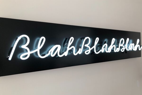
1. Logotype or Wordmark: It consists primarily of text, usually the organisation’s name or a specific word associated with the brand. It has typography and possibly custom lettering; think Coca-Cola and Disney.
2. Logomark, Symbol or Icon: It relies on a graphic symbol or icon to represent the brand without the use of text. These symbols are usually stylised and are designed to be easily recognisable even when displayed independently from the company name. Think Apple and the Nike Swoosh.
3. Combination Mark: A combination mark combines both a logotype and a logomark, offering the most flexibility in how it can be represented. The text and symbol work together to create a cohesive visual identity. Think McDonald’s and Starbucks.
4. Emblem: An emblem is a logo where the company name is encased in a symbol or icon, creating a complete design. Emblems often have a more traditional and formal feel. Think Harley-Davidson and BMW.
So next time you’re looking at brands, keep an eye out for these different approaches – how do they work for you? Which do you like? Not like? How do each make you feel? Which stick in your head and others that are less memorable?
WHAT MAKES A GOOD LOGO?
A great logo has to do a heavy lift for the organisation, there are some qualities it should have to work effectively- some tips!:
– Simplicity: Simplicity and clarity is key to a memorable logo. A clean and uncomplicated design is more likely to build recognition and be memorable. Cluttered design can be confusing and less effective.
– Legibility: If the logo includes text, the typography should be legible and easy to read (including contrast), even when scaled down or viewed from a distance.
– Versatility: A great logo should be adaptable to work across various platforms, materials, use cases and sizes without losing its impact.
– Storytelling: The logo should be relevant to the organisation’s brand story – its mission, vision, values, purpose as well as industry, and target audience. It should reflect the brand’s personality.
– Own-able: A great logo stands out and is distinct and unique from competitors. It should avoid similarities to other logos in the same industry, this can confuse consumers and make you look like a copy.
WHAT ARE GREAT EXAMPLES OF LOGO DESIGN?
Effective logo design considers the organisation’s vision, target audience, industry, and intended perception to create a visual identity that resonates with its stakeholders and stands the test of time.
Great examples of logo designs often exhibit these qualities, let’s start with the big ones:
Apple: The Apple logo is an iconic example of a simple yet powerful logomark. Its clean and minimalist design reflects the company’s commitment to simplicity, innovation and sophistication. It’s been an interesting logo to see evolve over the years – it’s become simpler and simpler over time – huge learning there.
Nike: The Nike Swoosh is one of the most recognisable logos globally. Its simplicity and dynamic appearance symbolise movement and excellence. Famously one of the cheapest and most impactful (nay valuable) logos of our time.
And smaller ones:
Pip &Nut: The bespoke combination logo incorporates a squirrel (it’s nut butter) and beautifully curvy letters in a warm brown that feel like the product. Clever, simple and yet interesting. This brand grew in the first 4 years from £0-£10M. Fab brand.
Action Against Hunger: A fine example of symbols being vessels for meaning – this brand identity is super simple, clear and directly communicates what it stands for and does. It distils there work – food and water – beautifully and simply.
City of Melbourne: This launched whilst I was living in the city and it certainly captured me then! It’s bold, inspirational and the logo reflects the diversity, dynamism and culture of the city. It’s a super flexible concept that enables many different result – creative and connected.
One to note: Coca-Cola hasn’t changed it’s logo since 1887, the company is now worth $98BN. If it ain’t broke…
One to heed a warning: London Olympics 2020 was such a controversial logo design that totally divided opinion and, as a result, nearly sunk the agency behind it. There’s being daring and there’s missing the mark.
HOW DO I BEGIN TO START DESIGNING A LOGO?
When it comes to starting your logo project, the best place to start is with the fundamentals – your brand story.
What do you stand for, why do you matter, who do you serve and how, what’s the big idea?
The best brands stand for something – be it strategic position, values, voice that sets you apart, addressing a need that’s IN need.
What sits at the heart of what you want to communicate to your audience with your logo? How do you want them to feel? What meaning are you trying to convey?
Meaning is rarely immediate and evolves over time – so you need patience for it to land, be accepted and gain value/power. Strike a balance between clever and necessary – subtlety can often be overlooked, it should be clear and simply visualised. If people are scratching their heads and left confused, there’s probably work to be done.
Invest in it – great designers have the skills to decipher meaning and turn them into visual stories – don’t scrimp on it.
Test it – it’s an absolute mammoth task to refresh a brand once it’s been done and rolled out (not to mention the cost!), so getting it right from the beginning will set you up for success.
Love it – it’ll be around for a while (hopefully!), so fall in love with your branding, want to show it off and share it!
WANT SOME INSPIRATION?
Some great people to follow for inspiration on pure logo design:
James Martin at Made by James
Reagan MacKrill at G’Day Frank
Motto Design in New York
What’s your logo story?
L