We know that the lifeblood of the business (besides copious amounts of coffee, sweat and tears) is the strength of your brand.
And the beauty and difficulty with this is that this never sits still – it’s a living entity that needs growing each month, whether it be a new event, a new product launch or engaging social posts.
How do we ensure that at every step of the brand growth and communications the brand is accurately represented, consistently and in the right tone? Enter brand boards and guidelines.
Your visual communications include your fonts, colours, imagery, patterns, and graphical elements that make up your brand identity. All of these pieces come together in a brand board or guidelines.
If you’ve worked with a designer or you’re a DIY master, you may be have come across these before. They offer a reference for all these items.
You may be asking – “What’s the difference between each one and do I need them all?”. See the distinction below:
A brand board is a one-page, quick reference guide for your brand’s visuals. It should include: logo and any variants, tagline, fonts, colours, imagery and graphic elements. See an example here:
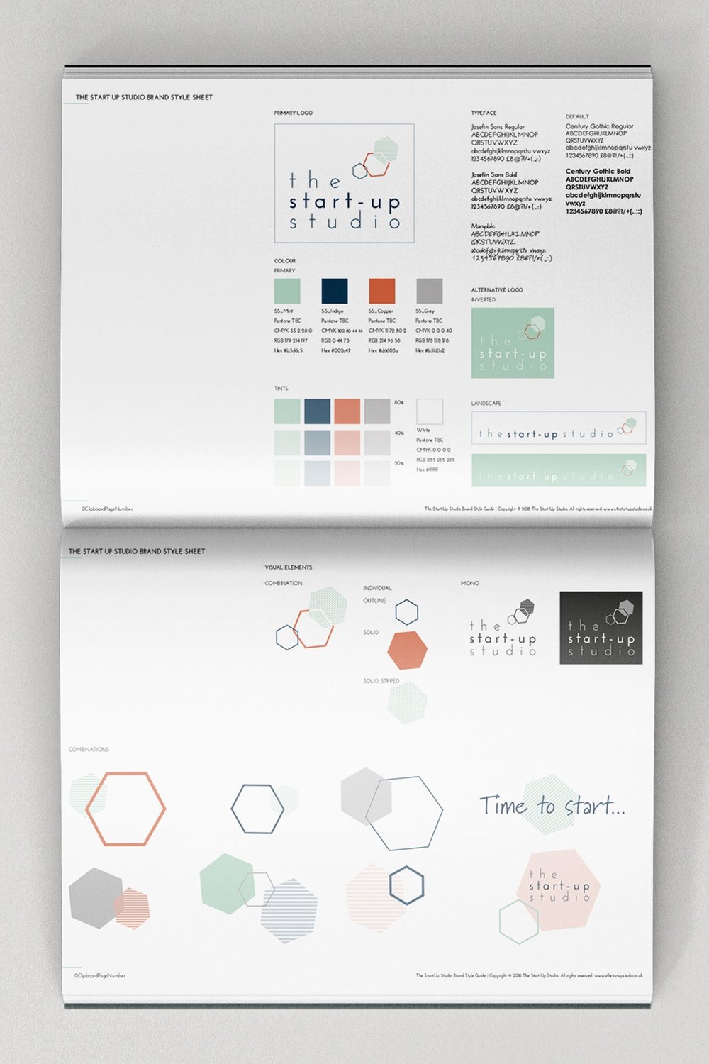 The Start-Up Studio Brand Board
A style guide is a short document that outlines the same and may also include some simple rules around how to and, importantly, not to do with the elements. See an example here:
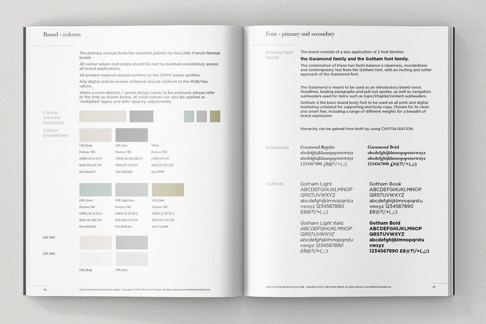 Little French Retreat Style guide excerpt: colour palette and font family
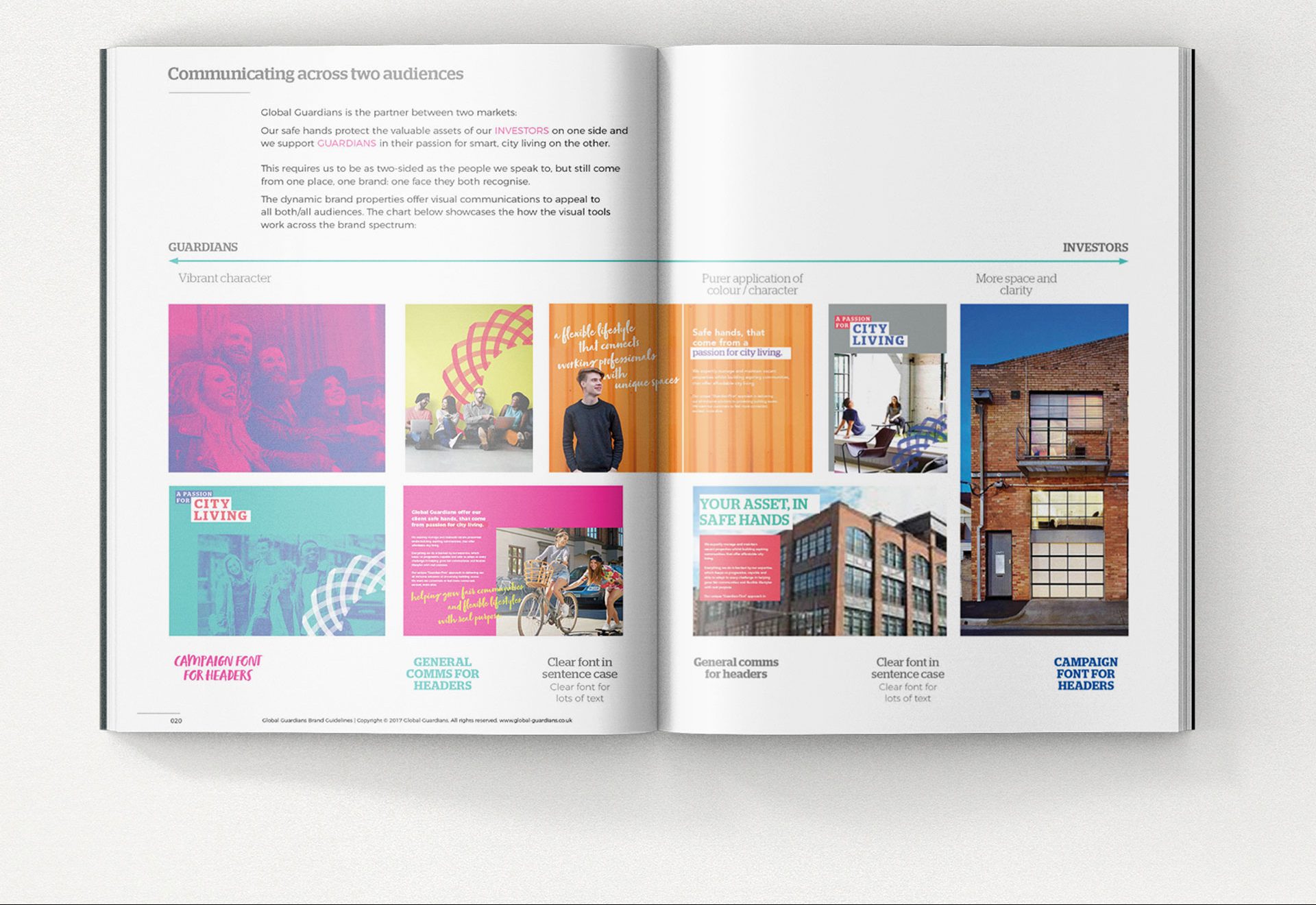
Brand guidelines is a comprehensive document that outlines all the visual elements and may also include the following: brand positioning and lead messaging, spacing rules, dos and don’ts with the logo, spacing and colour application, examples of assets such as event collateral, print materials, document designs, social media posts – tailored to the business size and level of activations. See an example here:
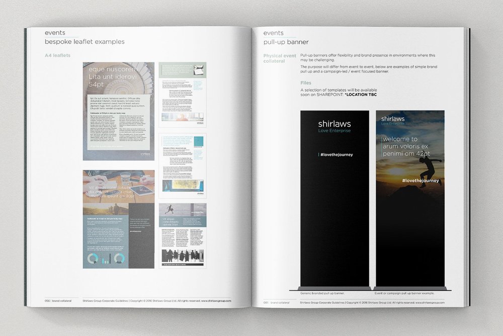 Shirlaws Group Guidelines excerpt: event collateral
Consider your business size and planned activities and assess which level of brand guide you require.
How do you make a brand board?
Start with the basics. Do you already have a logo, maybe with a few colour variations? Do you have a lead, accent and maybe default system font? Have you a set colour palette, any patterns or graphics you use? Or are you starting from ground zero?
If you are starting from scratch, you can follow these tips for developing your brand visual toolkit. If you’re DIY-ing it, this can be a fun process, but may take some time. If you’re planning on hiring a designer, ensure they cover all the brand elements of a brand board, as a minimum. Remember: a logo is just one part of the whole identity system.
Are you an online business, event-base, retail/offline or a mixture of these? These can help shape what items you NEED in your board for starters. Do you need print-friendly imagery (you may need to purchase these), vector illustrations, digital animations, full colour space/all colour format break-downs etc.
The brand board, for me is the outcome of the PERSONALITY phase of the Brand CORE IDEA process I work through. Here are the steps I follow when turning the PERSONALITY into a brand identity:
1. The power of the Pin – get inspired with a (virtual or physical) mood board.
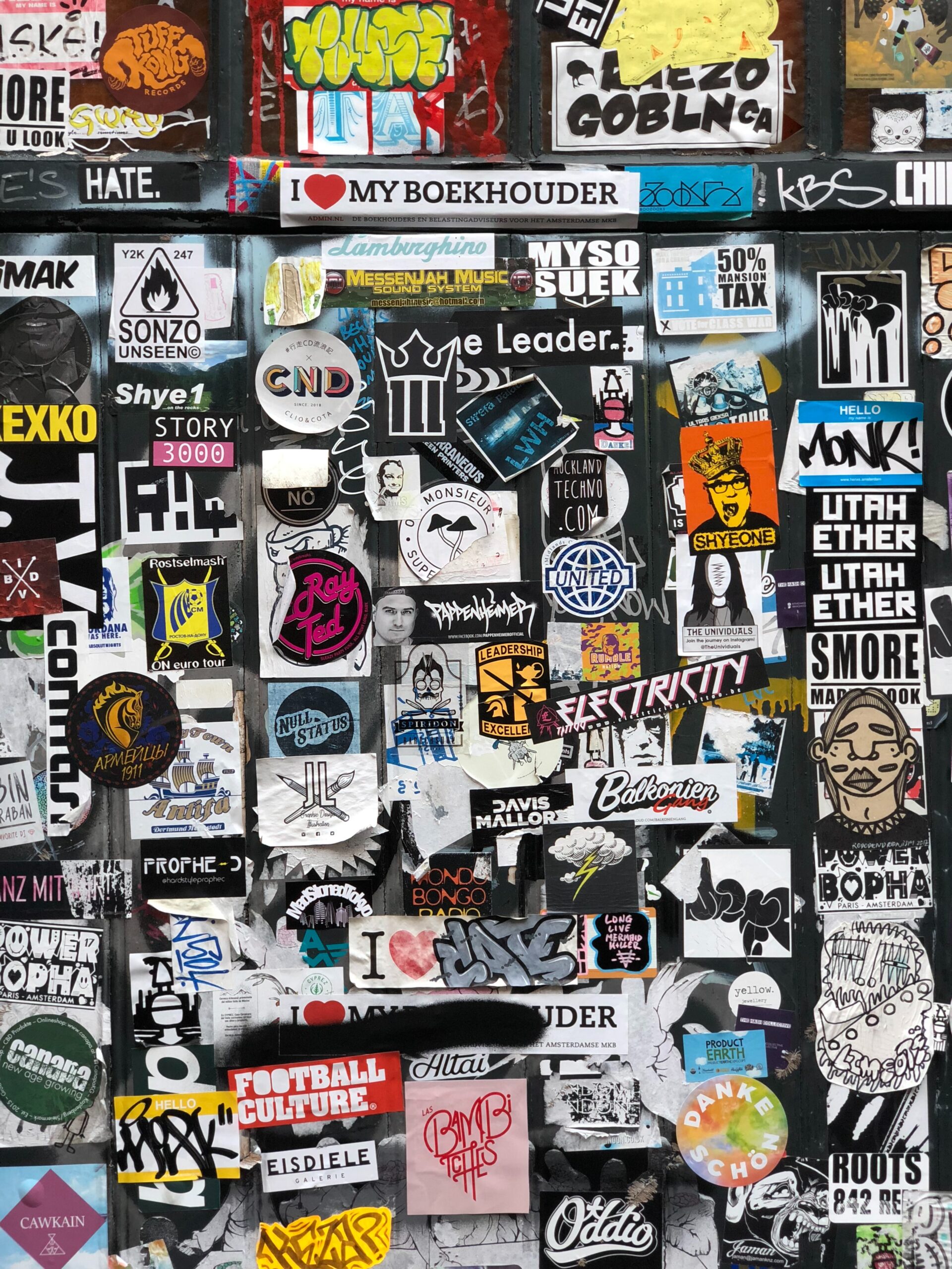
You need a starting point and direction for your visuals. Where best to start but by trawling through inspirational examples, looking at images that resonate and other branding examples you love. These don’t need to be in your industry! Even a postcard or scarf pattern can be the beginnings of something big…
You brand strategy (the 4P’s – see my worksheet here), will help you establish if you’re minimalist, bold, feminine, adventurous, simple, textured etc. Use your CORE IDEA as your guiding light and ask yourself if the images and examples you’re collecting reflect this? Try not to get steered off course with other beautiful things this is easily done!
Take some time to look at all elements – logo (icon or logotype), fonts, colour palettes, images, examples of layouts or websites that align with your vision.
2. Create your biggest visual asset – your logo.
Reflect on examples that you’ve collected in your mood board and brainstorm how your logo or logotype may look. Consider the following:
-
Would an icon or logotype (text-based) best suite your brand?
-
What visual elements might represent your brand?
-
What is the most important thing your logo need to communicate?
-
Do you want to relay any values or features of you brand through your logo?
While building a logo is an involved and often frustrating process, it sits at the heart of you brand identity system. Patience is key – try a few ‘rounds’ of designs, different versions, colour applications, stacked, landscape, icon or not icon etc. Seek feedback from others. Don’t rush this.
3. Compile your palette.
Now you have a good feel of the direction from your mood board, you will start to see a rhythm, pattern and balance of colours. Select 2-5 colours that dominate. Stuck? There are a couple of helpful sites that generate schemes for you: try coolors.co and design-seeds.com for inspiration. As you go, try and capture the HEX code, RGB and CMYK references for each colour.
When selecting your palette, consider the following:
-
Do these align with the CORE IDEA, vision and audience of the brand?
-
Are you distinctive enough compared to you competitors?
-
Do they work with simple principles of colour association and emotional responses?
-
Are they (or combinations of them) suitable and legible for their application – digital or print?
4. We are family… your font family.
While choosing fonts and colours may be done in parallel with the logo development itself, you can also select secondary fonts that work in harmony to add character, distinction and hierarchy of messaging across you other collateral. Consider the following:
-
Select a basic serif or sans-serif font to be used as body text that’s legible, appealing and practical. You can get a whole host of free fonts online, or you can purchase font bundles from many online stores such as dafont.com, fontsquirrel.com, 1001fonts.com.
-
An accent script or display fonts will help add character and pull out headlines etc.
-
Select a ‘default’ font that aligns with your main, body font, that can be used across all PCs and Mac combined – a font from the default library of fonts that comes with the computer.
I recommend keeping your font family to no more than three fonts in order to maintain order and consistency.
5. Create patterns, icons and other graphical elements.
Signature patterns and icons are a great way to build the brand personality, add charm and richness to the brand identity. Consider:
-
Using patterns as backgrounds for your web design or over lays on images
-
Icons can help simply visualise your services or products
6. Put them all into your brand board.
You have a logo suite, colour palette, font family and graphic elements. These are your foundations. You can lay these out onto a page to see how they all sit together, in one place. I have created a template you can download HERE.
7. OPTIONAL – build out your basics into fully fledged style guides and guidelines.
I highly recommend working with a designer to help flesh out your full brand identity system. They will pull together your tone of voice, key positioning, the visual elements and wraps simple rule around them, with examples of how these could work together in a number of applications. This does not have to be overly complex, but should grow as you increase your brand activations and activities across online and offline communications.
Using brand guidelines for consistency
Brand boards, style guides and guidelines are created to ensure consistency across your brand’s visuals. This means only the fonts, colours and graphic elements in these are to be used, no matter what is produced.
How these elements are pulled together is for creative interpretation and should be flexible.
TIP: To use an analogy close to my heart – food: I like to think of the brand assets as an ingredients list and the guidelines as suggested recipes. You should have creativity and flexibility within the brand assets, so you can build out what you need. They need to have the same flavour – but no one wants to eat the same meal every day! Now I’m hungry…
The way to view these documents is they should be comprehensive enough to give to any designer and they will understand what you’re about, what you represent, how you show up, your tone and visual narrative – this will allow them to build any brand communications for you with consistency and ease.
